

When I started to write an article about culture, I wanted to use some scales in a book to explain the differences between culture. However within the book, it doesn’t have the chart I need. As an analyst who’s familiar with tools like Tableau and Excel, my first intuition was to directly use those visualization tools. However I realize when all my values are categorical values, I can’t really draw lines between the points. For example this is what I get out of Tableau.

There might be some ways to fix it, but instead of investing time on Tableau, I decided to use python which is a lot more flexible, and instead of creating everything from scratch, I decide to test whether my best friend chatGPT could help me with this task.
So I explicitly described what I want to ChatGPT.
Hi I have a data table with 3 categorical values. Area, country, score. I want to draw a line chart between the area and score, with each country as a different color. Can you create a python script for me to read the csv file on my computer, and create the graph above?

Within a few seconds, ChatGPT gave me the scripts and reminded me to change my working directory to get the file.
I happily ran it within my Jupiter Notebook and replaced the file address with the actual one. However it looks like something is wrong.
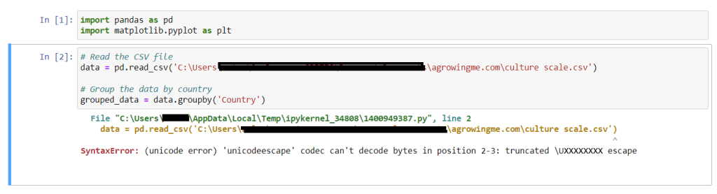
Not sure where the issue was, I asked ChatGPT on how to solve it.
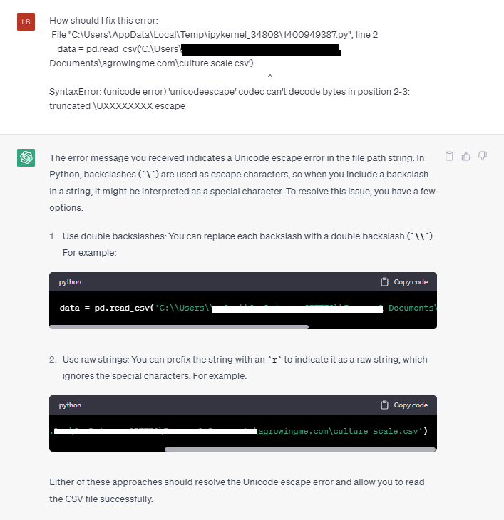
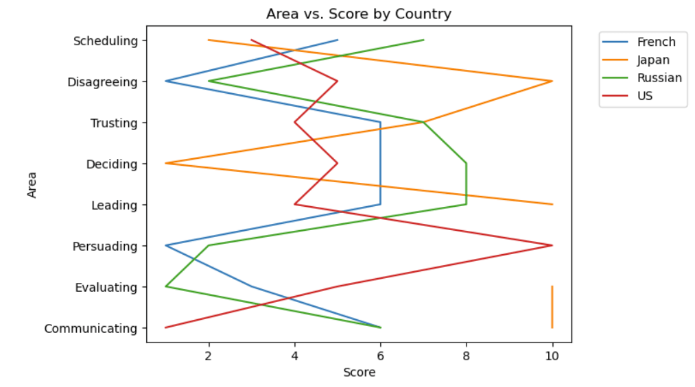
I followed the second option listed and issue solved immediately, and I got this chart instead.

Obviously it’s not satisfactory enough as the x scale is overly crowded. And I would like to swap the x and y axis.
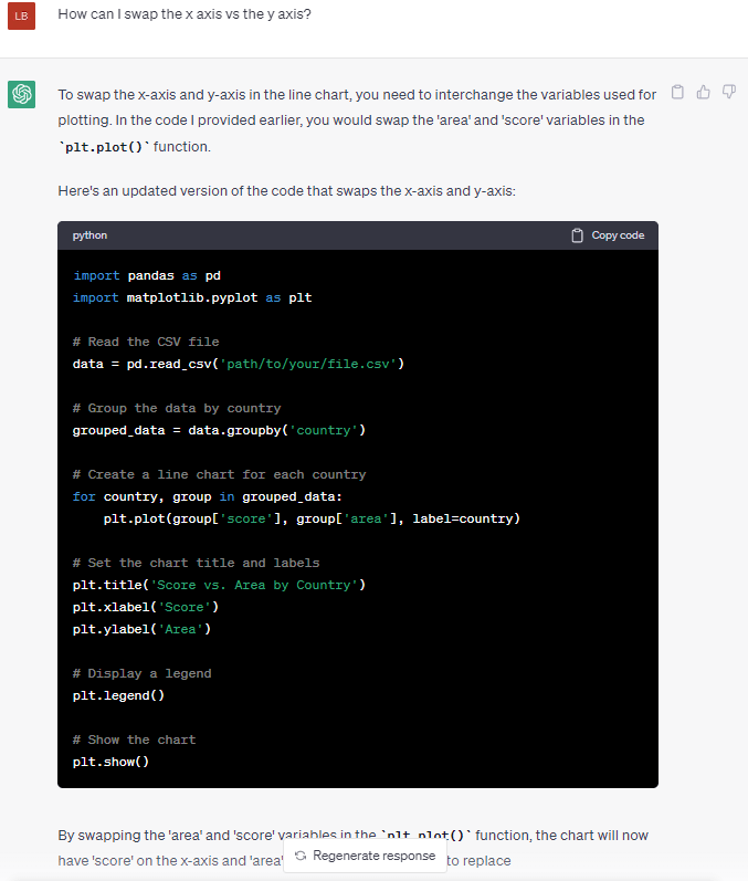
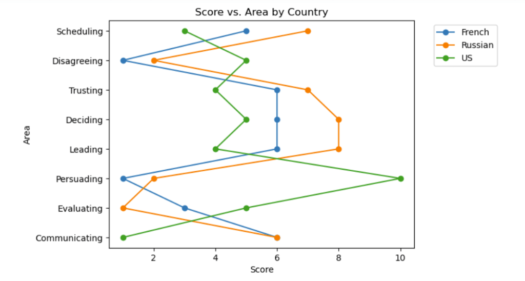
Following the new code, I got a much better version with clear letters.

However it looks like the legend is not at a position that I’m happy with. To get the legend out of the graph, I requested ChatGPT to change again.
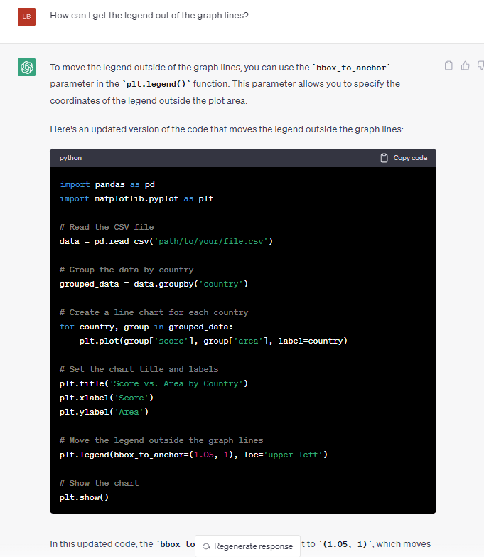
I added the legend piece to my code, and without understanding how things work exactly, my legend is out of the graph now. Hurray!
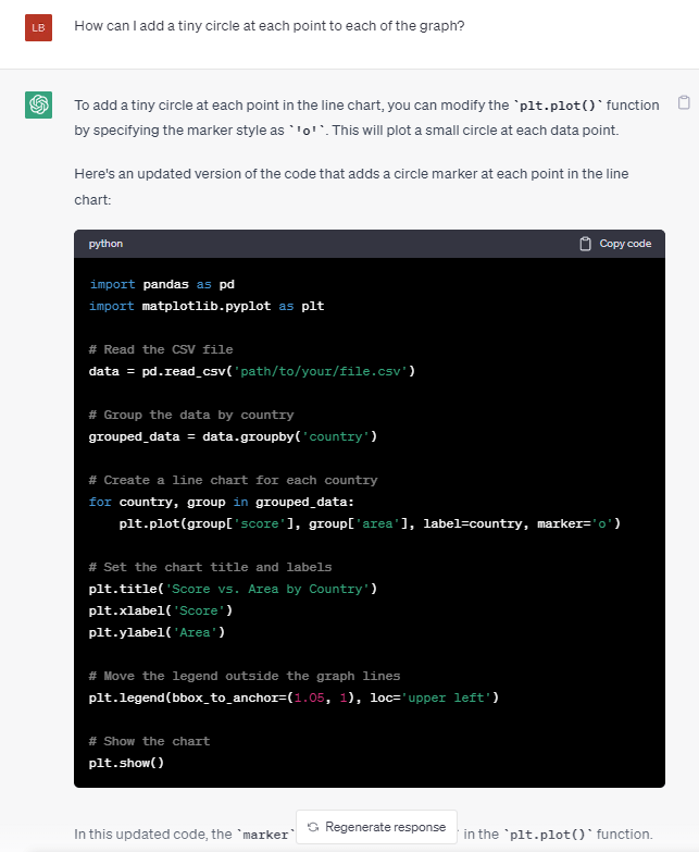
I’m closer to what I need, but the current graph looks a bit hard to understand where each point is exactly. I want to add some small circles at each point.
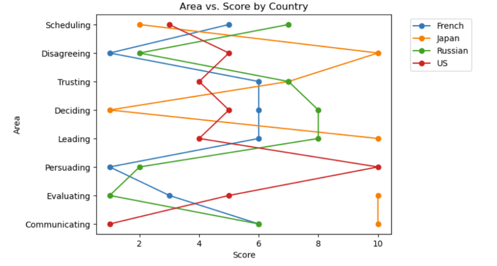
It looks like the marker = 'o' piece made the difference, and here’s what I see after the tiny modification.
Lastly I notice that the data for JP seems discontinuous at one point of time due to missing data. I decide to move that in my code and asked ChatGPT again.
Voila, it’s exactly what I want. Clear and I can easily see the biggest cultural differences between these three countries, and potentially build a strategy to have more effective communications with the teams.
ChatGPT had completed my task successfully within 10 mins, and I’m pretty sure if you want to modify other parameters it could be extremely easy as well. Hugely helpful!
As this is so easy to use, I’m super confident that we can use it for more advanced visualizations, waterfall chart, sanky diagrams, venn diagrams as well.

Leave a comment